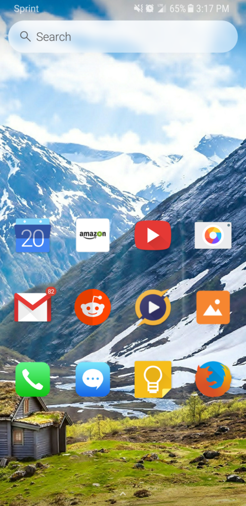
I have to credit iOS for having a clean and simple interface. Android is far more customizable but finding a good launcher and overall interface is not always an easy task. I have toyed around with a lot of different launchers until I settled on this setup.
I concede that Nova Launcher is the best for overall customizability and having the most features. But when it comes to decluttering and consuming the least time, I always go with Evie Launcher.
Evie Launcher is simple to customize. It is lightweight and good on battery. The search bar runs live on the home page and it quickly searches for either apps on your phone or web results.
Folders can be made on the homepage although they cannot unfortunately be made for the app drawer. By pressing an app for a few seconds, you are able to remove it from the home page, uninstall it, change the icon image or go to app info (where you can force stop or clear cache).
Here are my settings:
* 105% icon size
* No icon text labels
* Swipe up for App Drawer
* Vertical alphabetized list in App Drawer
* 2 home pages w/ 12 icons each
* Bloatware and rarely used apps hidden
* Notifications on most apps are blocked
* No widgets (apart from the search bar)
* Apps in home pages are hidden from the App Drawer
I found labels to be redundant because the text gets cut off and I already know the names of the apps I use. Unfortunately Evie doesnt allow for the removal of labels on the App Drawer so I went for the alphabetized list for aesthetic reasons.
Evie allows icon packs to be imported with ease. I mainly use the free “Moonlight” icon pack from the Play Store, but it’s also easy to mix and match icons from different packs depending on which one has the best icon. Sometimes I’ll go with icons from the free “Adastra” icon pack or the default icon.
For the home desktop, I find that 2 pages is ideal. 3 or more tends to get confusing to navigate. I had wanted to use only 1 home page, but I wanted more apps to be readily available. With more page, it can be a bit confusing to navigate. I find 12 apps per page to be the most balanced choice between removing clutter and also having choice. I don’t use a dock because the S8 is vertical; leaving the apps in the center makes them most easier to reach with the thumb.